
User Experience, Design Systems, Product Design
Redesigning a dashboard to make it easier for college students to connect and converse with their mentors
Challenge
Boston-based mentoring platform Mentor Collective needed help with a complete UX overhaul of their Educator Dashboard - an interface that enables college students and their mentors to connect and foster a rewarding mentoring relationship.
I was brought in to help channel their user feedback into meaningful UX/UI changes, build out a new design system, and optimize their new platform for mobile.


User Research
By the time I joined the project, the Product Team had already interviewed users to better understand where the current UI wasn’t meeting their needs.
I helped them channel this data into a Task Hierarchy, defining each “job” users need to accomplish within the platform, and ranking its overall importance to mentors and mentees.
This helped us focus our efforts on the most important problem to solve, and helped me get a sense of the interface’s visual hierarchy.
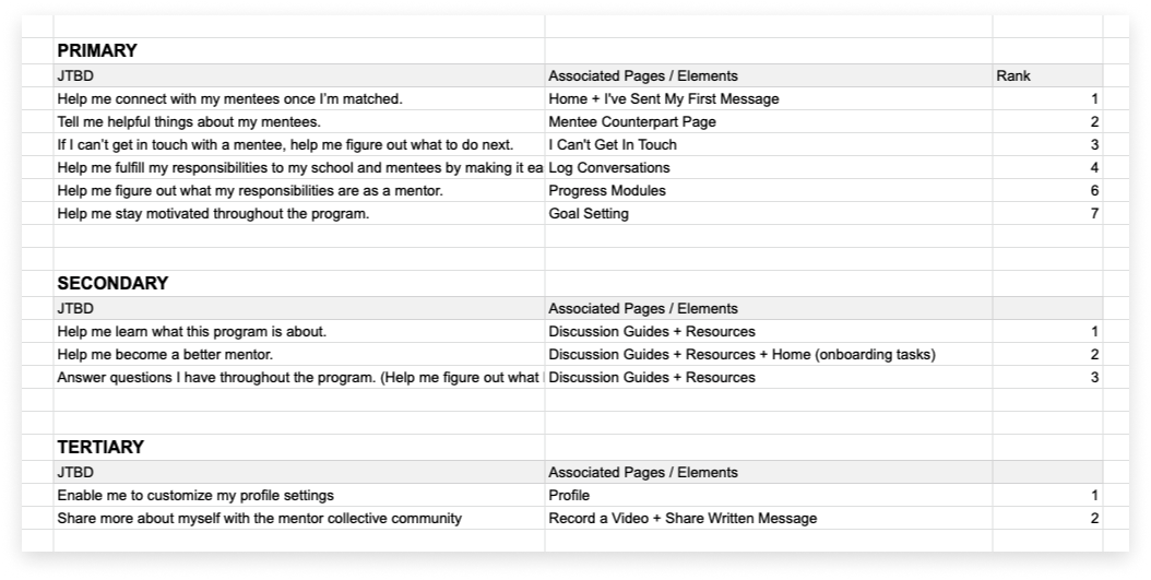
Mentor task hierarchy

Mentee task hierarchy
Solution
Overwhelmingly, the biggest issue with the old interface was it was difficult for Mentors and Mentees to effectively “Connect” by logging Conversations with their counterpart. This mechanism would need to be treated as a primary function of the new interface.
Hypothesis: making the mentor/mentee matching and conversation logging mechanism more prominent in the UI will lead to faster initial connection, and increase conversation logging between mentor/mentee pairs.
Design System
The goal of the design system was to create a foundation for the product’s new visual direction and help ease the development team’s adoption of the new UI in React.
To start, I expanded their existing style guide with more colors, more defined type scaling, and guides for elevation and spacing. Since mobile accessibility was a top priority with the redesign, I also defined a new scalable grid.


I then utilized Atomic Design to create a complete component library in Figma, designing components around the box model.


Prototype + Usability Testing
I developed a Figma prototype for the team, and helped them refine a Usability Test script designed to validate the new design direction.
After a few rounds of testing, it was clear that both mentors and mentees were able to connect and converse with their counterparts much more efficiently than before.
Additionally, the Product team reported that confusion amongst newer users around what to do first when logging into the platform was essentially non-existent.

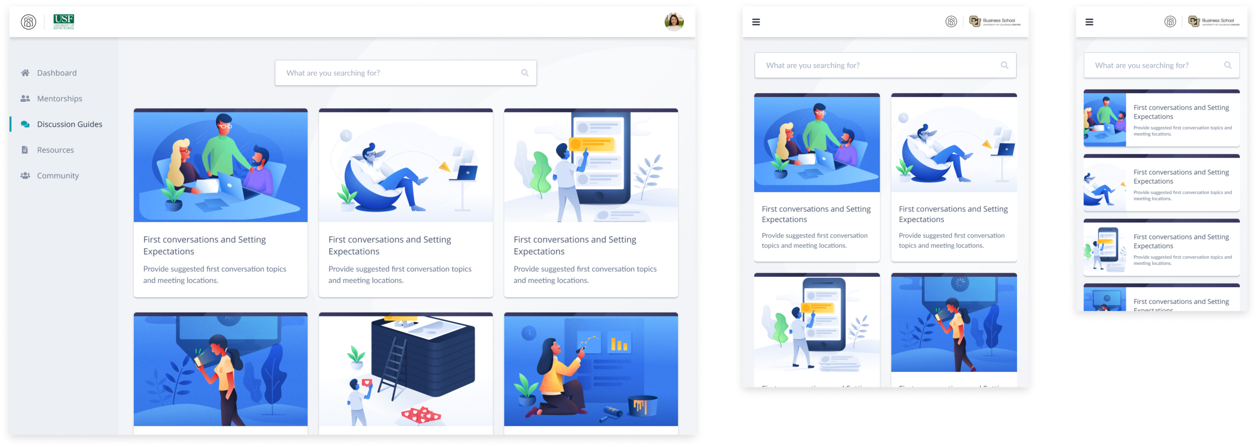
Final Designs
After a few weeks of testing and refining, we landed on the final designs displayed below.


Results
Feedback from both the Mentor Collective team and the community was overwhelmingly positive, with Mentors and Mentees reporting clearer visibility into their connections, and an easier time logging conversations. Icing on the cake, the development team reported the Design System saved them 2 weeks of development time!